Project Description
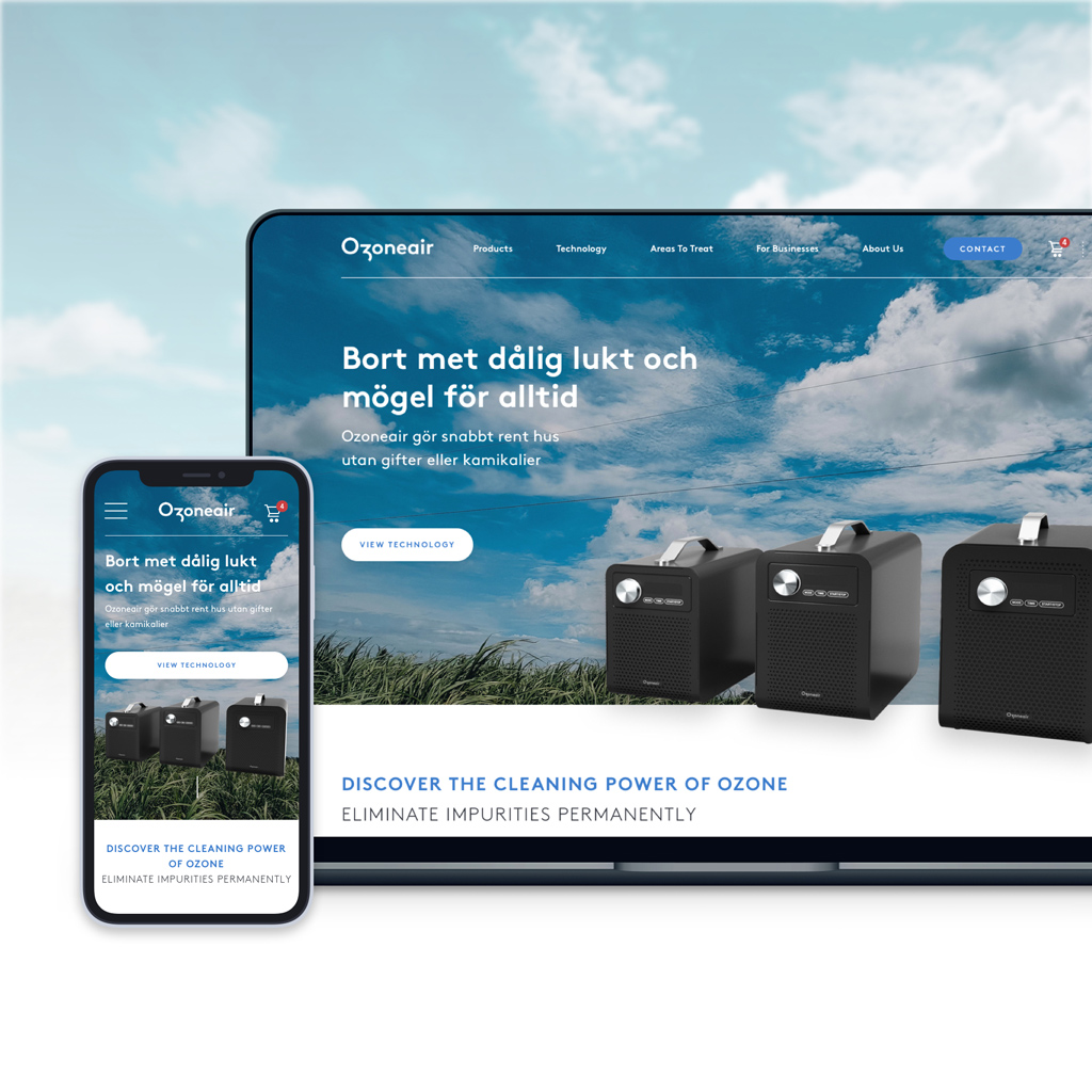
OzoneAir
Website revamp for a Swedish company that markets ozone-based air purifiers for residential and commercial use.

By analysing Ozoneair’s visitor behaviour and patterns through various tools, I was able to redefine the site user experience to improve customer time on site and conversion rates, and update the design to provide a more pleasant, informative experience from the landing page to the checkout process.
Introduction
OzoneAir is a tech start-up based in Lulea, Sweden, creating value for their customers by purifying the air in their home/office environment. With catering to both B2C and B2B markets, these air purifiers transform oxygen into ozone that attacks and eliminates bacteria, allergens and micro-organisms in the air.
While already having a steady local customer base attained through its well-performing products and existing website, OzoneAir intended to branch out to other countries in the Scandinavian region with their current product range.
Identifying The Problems
Upon analysis of the current site statistics, there was a high percentage of visitor drop-off rate in the homepage, which had a snowball effect to the subsequent pages. Therefore one of the main goals here would be the redesign and optimization of the landing page primarily for mobile, as almost 2/3 of all site traffic was on mobile devices, with desktop made up another 1/4.


Above: The typical customer journey consisted of
- Homepage
- ‘Remove Bad Odors’ Page
- ‘Clean A Space’ Page
- Product Page
- Checkout
- Thank You Page

Above: Hotjar and Google Analytics were mainly used to diagnose issues.
Summary of Insights
- It wasn’t clear enough that the products are ‘quick and easy to use’
- There should be a separate section for “Reviews and ratings” in the homepage
- There was a need to ‘clarify’ what Ozoneair is for. While the current content is good at describing what the products do, it didn’t explain as well what their purpose was for.
- There was a need to mention keywords such as “air purifier”, which would also benefit from SEO and Adwords.
- Customer ratings on the site are not easily findable.
- The products only appear too far down different category pages, forcing users to scroll more before arriving to browse through products.
- Many click on non-clickable icons
- The buy button is far from the product image when viewed on mobile devices
Method
I worked with the Head of Marketing of the company to find out areas where we could further improve the customer experience. We created a map of the customer journey flow to help us identify and triangulate where along the journey users would encounter paint points based on their tasks.
Following that, a revamped sitemap with agreed changes in information architecture was then drawn up, so that all members of the team were aware of any content that needed to be added or moved based on prior analysis.
This proposed sitemap also included two major additions: A ‘For Businesses’ page, which would help to channel visits by B2B users looking to purchase in bulk amounts, and a FAQ/Support page, which would provide additional information about product usage, purchase and shipping info and health information, when working with ozone gas.
Other suggested additions included content that would increase customer conversion rates, such as testimonials, video reviews, company interviews and a loyalty/rewards program.


We wanted to make ozone technology a key selling point that was more beneficial compared to traditional air purifiers, hence the need for the appropriate content to inform users.
The biggest challenge for this project was increasing conversion rates by educating users about the benefits of ozone technology with a sufficient amount of information, while reducing the overall bounce rate.
User Interface Design Phase
Typography

Color Palette
The new brand direction consists of a selection of refreshing tones, a sky blue hue complemented by mint green to signify a natural element. This combination is meant to visually reflect the tone and purpose of the brand. Since the products are also developed in Sweden, the primary blue is similar to that found in the Swedish flag.
Moodboard
Core values – Throughout the UI design phase, the new identity was encompassed by four core values, which we incorporated into the website experience:
- Innovation
- Design
- Quality of Life
- Environmentally friendly

Final Design
The design of the new site homepage better informed the products’ purpose within the first two folds of the browser height, which in turn, decreased the bounce rate. The icons were redesigned to be less ‘clickable’ which resulted in less user confusion.
I wanted Ozoneair to establish its growing credibility and increase the visibility of positive feedback by users by adding a Reviews section, which did help to increase conversion rate. The overall UI was revamped to better reflect the brand’s clean and breathable tone.