Project Description
Changi Airport
UI/UX redesign for an on-site & online visitor feedback system.

In collaboration with FreshlyGround, I worked to strengthen Singapore Changi Airport’s position as a global leader in hospitality and customer excellence by revamping the user experience and interface design of the electronic feedback system.
Project Objectives
The Changi Airport brand, as part of their effort to maintain their ranking as the best airport in the world for 8 consecutive years, approached us to work on their visitor feedback system, accessible via website as well as on-site kiosks. The main goals were to encourage customers to provide feedback on their Changi Experience while improving the overall workflow of feedback handling procedures by the back-end teams.
There was also a need to collect insights instead of just ratings, as this allowed the feedback team to identify and route detailed visitor feedback with a high degree of accuracy to the relevant departments.


The Kiosk interface before redesign
Identifying the Issues
We employed a range of user research methodologies split into 2 main parts– the first to gather quantitative data for the kiosk to observe its frequency of use and physical visibility, and the second to gather qualitative data for the interface itself.
Through guerrilla usability tests, user interviews, heuristic analyses and observation of the kiosks, some of the major insights we gathered were:
- An overwhelming number of Digital Displays at the airport and,
- Scarcity of kiosks, resulting in low participation for the on-site touchpoints
- Difficulty in locating kiosks– some were not very visible in large areas.
- Lack of affordance– no strong Call To Action on the kiosk display
- Issues in the dated interface design
By conducting interviews with the customer feedback team, we noted the interface language used– it was more catered to the back-end instead of to the user (taking into account the user’s emotional state and purpose of giving feedback), resulting in inaccurate category selection which led to a lack of detailed information for the routing team.
There was also a lack in situational context, and the feedback team needed to develop empathy in the users’ experiential journey leading up to the point of giving positive/negative feedback, in order to have a more accurate picture and improve on their service in that area.

Fieldwork, observation, live-testing and user interviews
Because there were many instances and prior narratives in which users would give feedback, we developed a Persona Spectrum overlaid over a prioritisation matrix to classify them into different levels based on importance.

We conducted research on the process of giving feedback, types of rating systems, and whether certain types would produce more actionable and accurate data gathered for feedback handling.
The challenge was working within the limited constraints in the existing routing structure of the feedback team, while making sure that we achieved visitor ease of use and efficiency.


Initial wireframing
Prototype & Testing
Multiple variations of prototypes were created which we tested their effectiveness in affordance both on-site and through the web portal. We recorded the success of these screens based on two indicators, the frequency in which passers-by ‘looked’ at the screen, and if they interacted with it.


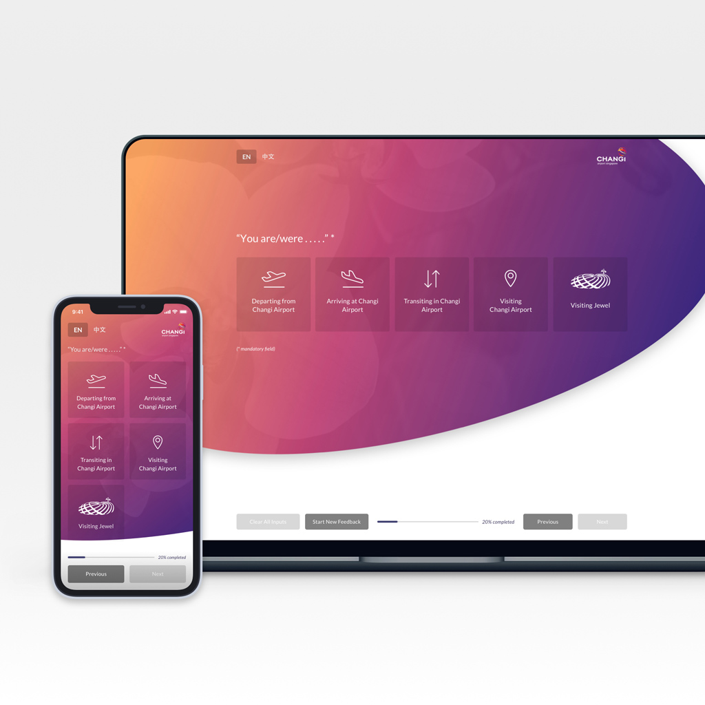
Final Design
The end result we came up with was a more conversational platform, taking away the traditional layout of a form with multiple inputs on a screen, and instead showing one question at a time, with the system automatically moving to the next screen once the necessary fields have been filled.
Changes were minimized to the information architecture, but the iconography was completely redesigned to allow for quicker identification, and, based on use cases of visitors, we categorized it a way where it felt more like a narrative– going into detail where, when, and how a particular incident occured that led to the positive or negative feedback sent.
This allowed the backend team to precisely route feedback without having to relearn an entirely new system while not overloading the visitor with too much prompts or information on a single screen.